

In the world of home design, color serves as more than just a finishing touch; it breathes life into spaces, influencing moods and defining aesthetics.Among the myriad ways to use color, color blocking stands out as a bold and dynamic technique that celebrates the interplay of hues. This artful approach involves pairing contrasting colors in intentional arrangements, creating visual interest and depth that can transform any room. whether you’re a seasoned decorator or a novice looking to refresh your living space, understanding the principles of color blocking can unlock a new realm of design possibilities. In this article, we will explore the fundamentals of color blocking, its historical roots, and practical tips for seamlessly integrating this vibrant style into your home, allowing you to curate spaces that resonate with your unique vision and personality.
Exploring the Fundamentals of Color Theory in Home Design
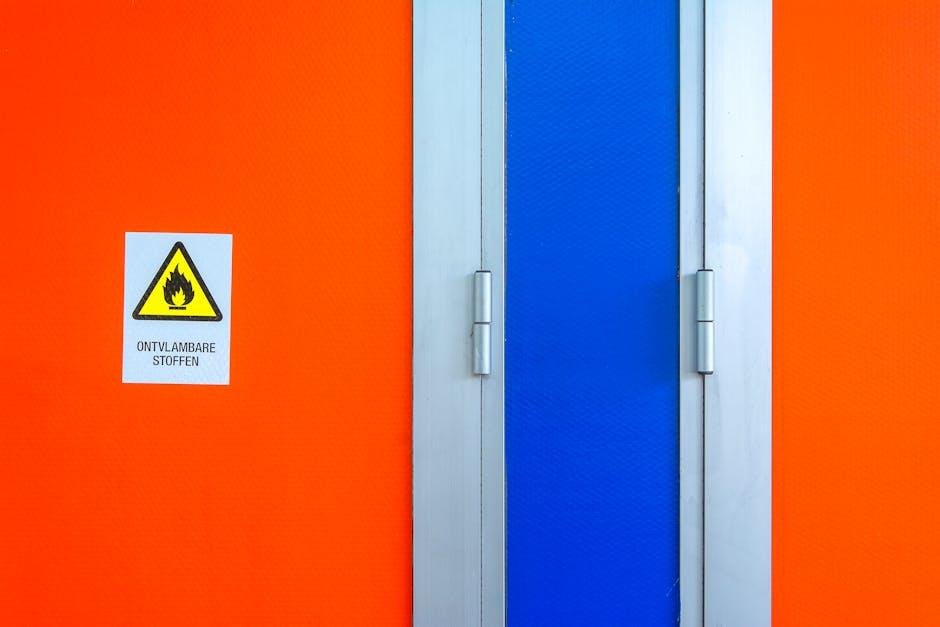
Incorporating color blocking into home design begins with an understanding of the basic principles of color theory. The harmonious balance of colors can create impactful atmospheres in different rooms. Complementary colors such as blue and orange or yellow and purple can enhance visual interest, while analogous colors like blue, blue-green, and green provide a serene and cohesive feel. By selecting a handful of colors that align with the mood you wish to evoke, you can orchestrate a stunning and dynamic space. When arranged thoughtfully, color blocking allows certain elements to pop while also maintaining a cohesive overall aesthetic.
To effectively utilize color blocking, consider the following strategies:
- Strategic Focal Points: Choose a feature wall or furniture piece as the primary focus of bold color.
- Neutral Balancing: Pair vivid colors with neutral tones like grays or whites to anchor the space.
- Layered Textures: Use different materials to enhance the visual experience of the colors.
Moreover, consider how different lighting can affect color perception throughout the day. Natural light can soften and warm colors, while artificial light can introduce unwanted hues. Experimenting with these combinations can yield surprising results, leading to a beautifully balanced and life-filled ambiance in your home.
Balancing Bold and Subtle: Choosing the Right Color Combinations
Creating a harmonious space often hinges on the delicate balance between bold and subtle hues. When selecting color combinations, consider using a mix of energized tones alongside calming shades to evoke a dynamic yet serene environment. Contrasting colors, such as vibrant oranges paired with earthy greens, can invigorate a room, while softer pastels with deeper blues can provide a sense of grounding. Remember, the key is to be intentional with your color choices to highlight certain features, allowing them to breathe without overwhelming the senses.
Explore various combinations through the correct distribution of colors across different elements in your decor. Below are some suggested pairings that can effectively create a balanced aesthetic:
- Warm Neutrals: Beige and Terracotta
- Cool Accents: Mint Green and Charcoal Gray
- Bold Statements: Deep Purple and Mustard Yellow
- Refreshing Touch: Seafoam and Coral
Employ this palette wisely in your design schemes, and you can create spaces that invite engagement while still feeling agreeable. To illustrate how different colors can interact, consider the following table listing the mood each color combination might evoke:
| Color Combination | Mood Evoked |
|---|---|
| Turquoise & Gold | Luxurious and Lively |
| Gray & Blush | Calm and Sophisticated |
| Cobalt Blue & Orange | Energetic and Playful |
Creating Cohesion Through Accents and Patterns
Incorporating accents and patterns into your color-blocking scheme can elevate the overall aesthetic of a space, providing depth and visual interest. To ensure that your design remains cohesive, consider the following tactics:
- Consistent Color Palette: Stick to a defined color palette that includes your chosen block colors as well as complementary hues to unify the various elements.
- Layered Patterns: Use layering techniques with patterns, such as stripes, florals, or geometrics, to create engaging focal points without overwhelming the space.
- Accentuate with Textiles: Incorporate patterned cushions, throw blankets, or area rugs to bridge the gaps between solid color blocks, enriching the sensory experience of the room.
Consider utilizing a balanced approach when placing accents. A thoughtful arrangement will not only highlight specific sections of your space but will also maintain a rhythmic flow. Here’s a simple table that illustrates how to distribute patterns and textures effectively:
| Element | Pattern/Texture | Color |
|---|---|---|
| Cushions | Geometric | Coral |
| Throw Blanket | Striped | Aqua |
| Rug | Floral | Mustard |

Practical tips for Implementing color Blocking in Every Room
To ensure that every room in your home embraces the beauty of color blocking, start by considering the dominant hues and how they interact with natural and artificial light. Choose a color palette that reflects your style—this could involve contrasting vibrant colors for a bold look or muted tones for a more subtle effect. Use color swatches to visualize how different shades will appear on walls, furniture, or décor items. When painting a wall, consider blocking sections by using painter’s tape to create geometric shapes or patterns. This approach allows you to test out different combinations before committing to a full paint job.
In addition to walls, use accessories to incorporate color blocking in a versatile manner throughout your home. Think about incorporating colorful throw pillows, rugs, art pieces, or even furniture that features multiple colors. Consider these tips to enhance your blocks of color:
- select a Primary Color: Use one color as an anchor that appears throughout the space.
- Mix Patterns: pair solid blocks with fun patterned items to add interest.
- Incorporate Neutrals: Balance vibrant colors with neutral tones to avoid overwhelming the space.
The Conclusion
the art of color blocking in home design is more than just a visual delight; it is a means of expression that invites creativity and personal style into our living spaces. By thoughtfully juxtaposing bold hues and contrasting shades, you can transform ordinary rooms into vibrant canvases that reflect your personality and enhance your well-being. As you embark on your own color-blocking journey, remember that the key lies in balance and harmony.Trust your instincts, experiment boldly, and embrace the magic of color. Ultimately, your home should be a sanctuary that resonates with your spirit—a place where every color tells a story, and every block of hue adds to the rich tapestry of your life. So grab your paintbrush and let your inventiveness run wild; the world of color is at your fingertips, waiting to be explored.

