

In a world bursting with vibrant colors and bold patterns, the allure of neutrals often goes uncelebrated. Yet, these understated hues hold a unique power to create tranquil spaces that exude elegance and sophistication. Whether you’re starting with a blank canvas or looking to refresh your existing decor,exploring the art of decorating with neutrals can transform your habitat into a serene sanctuary. From soft beiges and creamy whites to muted grays and gentle taupes, neutrals offer versatility and timelessness, allowing personal style to shine through without overwhelming the senses. In this article, we’ll delve into practical tips and creative ideas for incorporating neutrals into your home, showcasing how to balance warmth and simplicity while crafting a space that feels both inviting and chic. Join us as we unlock the potential of these calming shades and inspire you to embrace the beauty of understated design.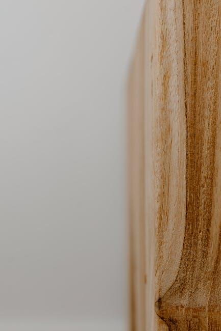
Embracing the Power of Neutral palettes
Neutral palettes can evoke a profound sense of tranquility and sophistication in any space, creating an environment that feels both inviting and serene. When utilizing a neutral color scheme, consider incorporating various shades and textures to avoid monotony. Layering elements like soft beiges, warm greys, and creamy whites can add depth, while materials such as wood, linen, and metals can enhance visual interest. Here are a few ideas to spark your creativity:
- Mix different textures: Use a combination of fabrics like wool, silk, and cotton.
- Add subtle patterns: Incorporate elements like stripes or organic prints in your soft furnishings.
- Highlight architectural features: Paint moldings or trims in a slightly darker hue for contrast.
In addition to color and texture variations, strategic use of natural light can elevate the overall appeal of neutral spaces. Large windows, glass doors, and mirrors not only reflect light but also create an illusion of spaciousness.To further enhance your design, you can establish a focal point with a statement piece, such as a bold artwork or a striking piece of furniture, to draw the eye and break the neutrality.Consider a simple reference table to plan your neutral palette:
| Color | description |
|---|---|
| Soft White | Brightens the space while offering a clean backdrop. |
| Warm Beige | Add warmth and coziness, perfect for living areas. |
| Cool Grey | Provides a contemporary feel that’s both stylish and chic. |
| Charcoal | Adds drama and can serve as an accent or base color. |
Layering Textures for Depth and Interest
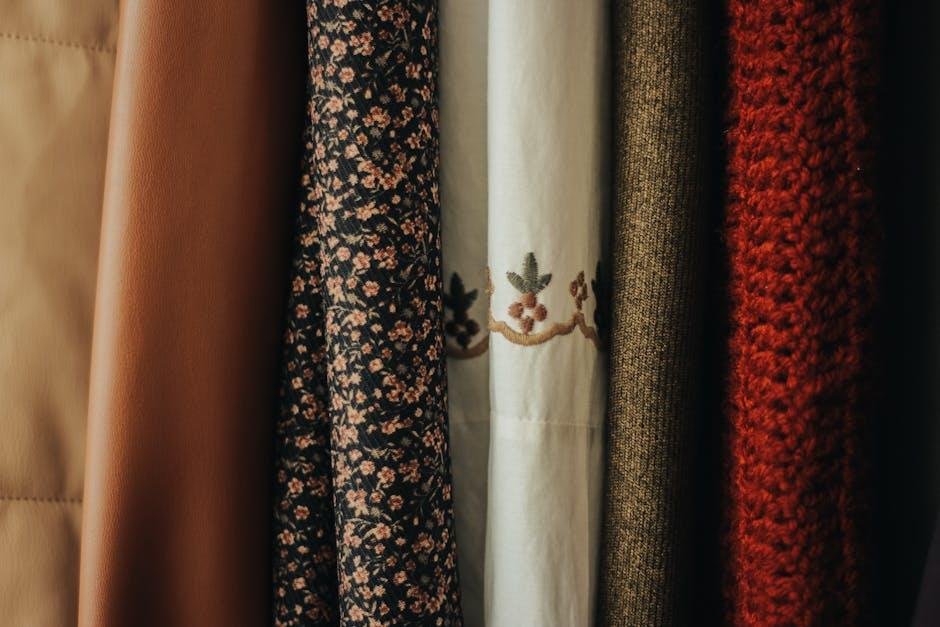
In the world of neutral decor, layering textures is essential to create a dynamic and inviting space. By mixing various materials, you can add depth that transforms a flat environment into a sensory experience. consider incorporating elements such as:
- Woven textiles: Plush throw pillows or a knitted blanket can provide warmth.
- Natural fibers: Rugs made from jute or sisal introduce an earthy touch.
- Metal accents: A brass lamp or steel fixtures can add a touch of shine.
- Wood grain: Furniture or decor with unique textures can enhance visual interest.
Moreover, it’s vital to balance these textures thoughtfully to avoid overwhelming the senses. As an example, you might combine a velvet sofa with a linen armchair, or juxtapose a rustic wooden coffee table with sleek ceramic decor. To illustrate how collaboration of textures can be effectively executed, the following table showcases combinations to inspire your next decorating endeavor:
| Texture 1 | Texture 2 | Effect |
|---|---|---|
| Soft Wool | Hard Marble | Cozy meets Modern |
| Rough Stone | Smooth Glass | Earthy Elegance |
| warm Wood | Crisp linen | Inviting Contrast |
Incorporating Statement Pieces into a Neutral Space
Adding a statement piece to a neutral room can transform the entire atmosphere, turning a plain setting into a vibrant visual feast. Here are some creative ideas to incorporate striking elements into your lightly hued surroundings:
- Bold Artwork: A large canvas or a unique wall sculpture can serve as the focal point of the room.
- Colorful Accessories: Introduce radiant throw pillows, rugs, or curtains that contrast beautifully with the neutral palette.
- Statement Furniture: Consider an accent chair or a coffee table in an unusual shape or vivid color to draw attention.
- Architectural Elements: Exposed beams or a unique light fixture can add character and pizzazz without overwhelming the space.
When choosing your statement piece, keep proportions in mind to preserve balance. If you opt for a large item, pair it with subtler elements to avoid visual chaos. A helpful approach is to create a focal point table that illustrates how different pieces can marry together within your theme:
| Element Type | Suggestion |
|---|---|
| Artwork | Large abstract painting with splashes of color |
| Furniture | Brightly colored accent chair |
| Textiles | Richly patterned throw pillows |
| Lighting | Modern chandelier with geometric shapes |

Balancing Warm and Cool Tones for harmony
Creating a harmonious atmosphere in your space often hinges on the interplay between warm and cool tones. To achieve a balanced look, start by selecting a neutral base—think of shades like taupe, cream, or soft grey—which can anchor the room while allowing for versatility. Incorporate warm elements like beige or terracotta accents in items such as throw pillows or artwork. This blend invites a cozy feel without overwhelming the senses. Conversely, employ cool tones like muted blues or soft greens in your décor items and fabrics, offering a refreshing contrast that balances out the warmth. This strategic pairing not only adds visual depth but also enhances the overall tranquility of your environment.
Here are some practical tips to seamlessly blend warm and cool tones in your decorating process:
- Layer your textiles: Use rugs,curtains,and cushions in both warm and cool tones.
- Select statement pieces: Choose larger furniture or art that embodies one tone while using smaller accessories in the opposite tone.
- Create a focal point: Focus on a specific area, such as a gallery wall or a fireplace, where the tones can interact beautifully.
For a quick visual reference, consider this simple guide:
| Warm Tones | Cool Tones |
|---|---|
| Beige | Soft Blue |
| Terracotta | Mint Green |
| Mustard Yellow | Lavender |
Insights and Conclusions
decorating with neutrals is not just a trend; it’s a timeless approach that brings tranquility and versatility to any space. By thoughtfully combining shades of white,grey,beige,and taupe,you can create a canvas that allows your personality to shine through while maintaining an elegant simplicity. Remember, the beauty of neutrality lies in its flexibility; it serves as a backdrop for your individual style, whether it be through bold accents, texture variations, or personal artifacts that tell your story. As you embark on your decorating journey, embrace the nuances of neutral tones, and let your creativity and creativity guide you. Your home is an expression of who you are—make it a reflection of serenity and sophistication. Happy decorating!

