

Coordinating Decor with Paint Colors: A Harmonious Approach to Home aesthetics
In the vast realm of interior design, the interplay between paint colors adn decor serves as a silent orchestrator of mood and ambiance within our living spaces. Whether you’re adorning a cozy nook with vibrant splashes or enveloping a room in serene pastels, the right color palette can transform the ordinary into the extraordinary. As we journey through the nuances of harmonizing decor with paint choices, we’ll explore the art of color coordination—unveiling tips, inspiration, and techniques that allow your surroundings to reflect your unique style. Discover how paint can be the foundation upon which lovely decor is built, creating a cohesive environment that feels both inviting and thoughtfully curated. Join us as we delve into the vibrant world of color, where every shade tells a story and every decorative piece finds its perfect match.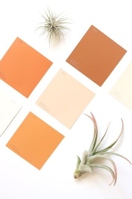
Choosing the Right Color Palette for Your Space
When it comes to selecting hues for your interiors, the right color palette can transform your space into a reflection of your personality and lifestyle. Consider the overall mood you wish to evoke; warm tones like reds and oranges create an inviting atmosphere, while cool shades like blues and greens foster tranquility. Additionally, blending complementary colors enhances aesthetic appeal.To achieve harmony, explore monochromatic schemes, where varying shades of a single color create depth, or opt for analogous colors, where adjacent shades on the color wheel form a cohesive look.
Another crucial aspect is the function of the room. For example, in a home office, you might prefer energizing colors—think vibrant yellows or clean whites—to stimulate creativity and productivity. In contrast, soft lavenders and muted blues can be perfect for bedrooms, promoting relaxation. Here’s a quick reference table to guide you in choosing the right colors based on room function:
| Room type | Suggested Colors | Mood/function |
|---|---|---|
| Living Room | Warm neutrals, earth tones | Inviting, agreeable |
| Kitchens | Luminous yellows, whites | Cheerful, energizing |
| Bedrooms | Soft blues, greens | Calming, restful |
| Home Office | Bright colors, whites | Motivating, focused |

Understanding Color Theory for Effective Decor Coordination
Color theory serves as the backbone of effective decor coordination. By understanding the relationships between colors, you can create a cohesive and harmonious space.Start by considering the color wheel, which illustrates the primary, secondary, and tertiary colors. Combinations like complementary colors (those opposite each other on the wheel) can create a vibrant contrast, while analogous colors (those next to each other) offer a more subdued and harmonious feel. For a well-rounded approach, think about incorporating various shades and tints of a color to add depth and interest to your decor.
When selecting paint colors, consider the mood you want to evoke and the overall aesthetic of your space. Soft pastels might create a serene atmosphere, while bold hues can energize a room. Use the following tips to guide your selection:
- Consider Lighting: Natural and artificial light can drastically alter how a paint color looks.
- Test Swatches: Always try out paint samples on your walls before committing to a color.
- Think About Existing Elements: Take into account furniture, artwork, and flooring when choosing paint colors.
To help visualize how different colors can interact, refer to the table below that outlines various color pairings and their effects:
| Color Pairing | Effect |
|---|---|
| Blue & Orange | Dynamic contrast that adds energy |
| Green & Beige | Natural and calming atmosphere |
| Gray & Yellow | Modern flair with a hint of warmth |

Textures and Finishes: Enhancing Your Chosen Colors
In the world of interior design, the magic frequently enough lies in the subtle interplay of textures and finishes, which can elevate your color palette from mundane to extraordinary. Consider incorporating a mix of materials to achieve depth and intrigue within your space. Some effective combinations include:
- Matte Walls with Glossy Accents: A matte finish can ground a room, while glossy elements such as a statement mirror or metallic decor add a touch of sophistication.
- Natural Textures with Smooth Surfaces: Pairing raw, natural elements—like wicker or wood—with sleek pieces such as glass or polished metals creates balance and warmth.
- Layered Fabrics: Incorporate various fabric textures in cushions, throws, and rugs to enhance comfort and visual interest, especially when contrasting soft linens against coarser fabrics.
Choosing the right finish can also bring out the beauty in your selected colors. A color with a satin finish reflects light beautifully, making it suitable for smaller spaces or dark rooms. In contrast, a flat finish can provide a cozy feel in larger areas. The effects vary greatly; here’s a quick comparison:
| Finish Type | Best for | Light reflection |
|---|---|---|
| Matte | Ceilings and low-traffic areas | Minimally reflective |
| Satin | Living spaces and kitchens | Moderately reflective |
| Glossy | Accents and trim | Highly reflective |
Accent Pieces That Complement Your Paint Choices
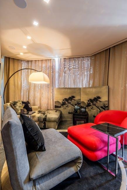
When it comes to enhancing your chosen paint colors,the right accent pieces can transform a room from basic to breathtaking. Consider integrating elements that bring out the best in your walls while adding character and charm.As an example, if your space features a soft pastel hue, rich wooden furniture or natural fiber rugs can create a grounding contrast that enhances the overall ambiance. Conversely, bold, vibrant colors like deep teal or burnt orange can be beautifully complemented with sleek metallic accents, such as silver vases or gold-framed artwork, injecting a modern twist into the room.
Additionally,textures play a crucial role in harmonizing your decor with paint. Explore options like textured throw pillows, knitted blankets, or woven baskets that add depth and visual interest. Don’t forget about flora; incorporating vibrant greenery or fresh flowers in colorful pots can breathe life into your space while echoing your paint choices. Here’s a quick guide to help you choose accent pieces according to various paint colors:
| Paint Color | Accent Piece Ideas |
|---|---|
| Soft blue | White ceramics, ivory throws, light wood accents |
| Mustard Yellow | Dark blue or gray pillows, rustic decor elements |
| Forest Green | Brass fixtures, warm wooden furniture |
| Coral | Turquoise textiles, natural rattan baskets |
The Conclusion
In the world of interior design, the interplay between paint colors and decor can either create a harmonious symphony or a cacophony of clashing tones. as we’ve journeyed through the vibrant palette of possibilities, it’s clear that intentional coordination can elevate your space, infusing it with personality and style. By understanding the fundamentals of color theory and learning how to effectively mix and match materials, textures, and hues, you can craft an environment that not only reflects your taste but also resonates with a sense of balance and warmth.
Remember, your home is a canvas waiting to be transformed. Embrace experimentation, observe how different elements interact under changing light, and don’t shy away from personal expression. Whether you’re drawn to bold contrasts or soothing monochromes, the key is to create a dialog within your space. As you embark on this creative endeavor, let the colors of your paint inspire the decor that surrounds them, culminating in a sanctuary that feels both cohesive and uniquely yours. Happy decorating!

